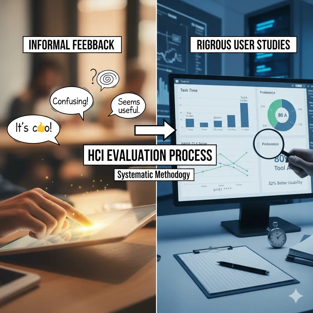
The HCI Evaluation Process: From Informal Feedback to Precise User Studies
cuongkane
@cuongkane
I have always had a strong interest in developing software solutions that address real-world challenges. However, I often find myself focused on enhancing technology to create the best tools possible, while it seems that the world increasingly emphasizes adding more features to user interfaces rather than prioritizing user feedback and evaluating the actual effectiveness of these tools.
Recently, I have delved deeper into this topic and discovered more about evaluating efficiently for human-centered design.
In this blog, I will provide a partial comprehensive guide on evaluation strategies within the field of Human-Computer Interaction (HCI) research, along with a full practical example.
1. Context: From Powerful AI to Meaningful Human Experience
In today's world, AI technologies evolve faster than ever.
New software and research prototypes appear almost weekly—each claiming to revolutionize how we work, code, or communicate.
But there's a growing realization in the research community:
Technical power alone no longer defines good software.
Most ideas are now built upon the same AI foundations—large language models, embeddings, retrieval systems, or visual interfaces. So what truly differentiates one system from another?
It's not just the algorithm.
It's the user experience—how effectively and effortlessly humans can achieve their goals when interacting with technology.
That's where Human–Computer Interaction (HCI) becomes essential.
What is HCI?
HCI is the bridge between what technology can do and what people actually need.
It focuses on understanding the human side of the system:
- How people think, learn, and decide
- How tools fit into their workflow
- How to make complex technology usable, efficient, and satisfying
In the age of AI, HCI ensures that powerful technology becomes useful technology.
2. Problem Setup: Why "Just Asking for Feedback" Isn't Enough
Many developers test their tools informally:
They ask friends to "try it out" and "tell me what you think."
While this may give surface-level impressions, it doesn't provide reliable or structured evidence.
The Problems with Informal Feedback
| Informal Feedback | Why It's Insufficient | What's Missing |
|---|---|---|
| "It's cool!" | Too vague—what specifically worked? | Measurable evidence |
| "It's confusing" | What was confusing? When? For whom? | Context and specificity |
| "I liked the visualization" | Did it actually help you understand code faster? | Effectiveness measurement |
| "Seems useful" | Would you use it daily? Better than alternatives? | Comparative evaluation |
Feedback like this lacks:
- Consistency: Different people focus on different aspects
- Depth: Surface reactions don't reveal underlying issues
- Validity: Personal opinions aren't statistically reliable
- Actionability: "It's confusing" doesn't tell you what to fix
What Research Needs
In research—especially when introducing a new AI-based interaction—we need a systematic way to evaluate whether the tool truly improves the user experience.
That systematic way is the HCI Evaluation Process.
It turns casual feedback into measurable evidence—combining:
- Scientific rigor (for research validity)
- Human understanding (for usability insight)
3. The HCI Evaluation Process: A Human-Centered Framework
When evaluating a system in HCI, we work across three stage:
🧪 Stage 1: Study Design
What it is: The structure and methodology of your experiment.
Why it matters: Ensures your study is fair, repeatable, and scientifically valid. Good design separates real effects from random noise.
Common Study Designs
Within-Subjects Design
- Each participant tries all conditions (e.g., your tool AND a baseline)
- Advantage: Controls for individual differences (skill, speed, style)
- Use when: You have few participants (4-8) and want maximum statistical power
- Example: 5 developers each test both your new tool and the base line tool (or without the tool).
Between-Subjects Design
- Each participant uses only one condition
- Advantage: Avoids learning effects and fatigue
- Use when: You have many participants (20+) or learning effects are severe
- Example: 10 developers test your tool, 10 different developers test baseline
Counterbalancing
- Systematically vary the order participants experience conditions
- Advantage: Prevents bias from task familiarity or fatigue
- Implementation: Half start with Tool A, half with Tool B
- Critical for: Within-subjects designs to ensure fair comparison
Why Design Matters
These strategies make your results trustworthy—they ensure any performance difference comes from your tool's design, not from:
- Random user variation
- Learning effects
- Fatigue
- Task order bias
📏 Stage 2: Measurement Instruments
What it is: The specific tools and metrics you use to collect data.
Why it matters: Different instruments reveal different aspects of user experience. You need multiple perspectives to get the complete picture.
Common Instruments
NASA-TLX (Task Load Index)
- Measures: Mental workload and perceived effort
- 6 Dimensions: Mental demand, physical demand, temporal demand, performance, effort, frustration
- Scoring: 0-100 (lower = better)
- Use for: Understanding cognitive cost of using your tool
- Example insight: "Tool completes tasks faster but users feel mentally exhausted"
SUS (System Usability Scale)
- Measures: Overall perceived usability and satisfaction
- Format: 10 questions, 5-point Likert scale
- Scoring: 0-100 (>70 = good, >85 = excellent)
- Use for: Benchmarking against industry standards
- Example insight: "Tool scores 78—good usability, but room for improvement"
Task Performance Metrics
- Time: How long to complete tasks
- Accuracy: Correct vs incorrect answers
- Success Rate: % of tasks completed successfully
- Error Count: Number of mistakes made
- Use for: Objective effectiveness measurement
- Example insight: "Tool reduces onboarding time by 40%"
Think-Aloud Protocol
- Method: Users verbalize thoughts while working
- Data: Audio/video recordings + transcripts
- Use for: Understanding reasoning, discovering confusion points
- Example insight: "3/5 users said 'Where's the back button?' at minute 8"
Semi-Structured Interviews
- Method: Open-ended questions after tasks
- Data: Qualitative responses revealing "why"
- Use for: Explaining quantitative results, gathering improvement suggestions
- Example insight: "Users loved visualization but wanted zoom controls"
Why Multiple Instruments?
Each instrument targets a different dimension of user experience:
-
NASA-TLX → COGNITIVE COST (how mentally taxing?)
-
SUS → SATISFACTION (how pleasant to use?)
-
Task Performance Metrics → EFFICIENCY (how fast/accurate?)
-
Interviews → CAUSALITY (why these results?)
Using only one metric can mislead—a tool might be fast but frustrating, or accurate but exhausting.
🧩 Stage 3: Analysis Strategy
What it is: How you make sense of collected data and draw conclusions.
Why it matters: Raw data means nothing without interpretation. Analysis transforms numbers and quotes into actionable insights that can guide design decisions and validate research claims.
Quantitative Analysis
Quantitative analysis compares numeric results statistically to determine whether observed differences are real or due to chance.
Common techniques:
- Descriptive statistics: Calculate means and standard deviations to summarize your data.
- Paired t-tests: Compare participants' performance across conditions to test if differences are statistically significant (p < 0.05).
- Effect sizes (Cohen's d): Measure the magnitude of difference—0.2 is small, 0.5 is medium, 0.8+ is large.
- Visualizations: Use bar charts and box plots to make numbers interpretable at a glance.
Example output:
"Users rated my tool 20 points higher in usability (SUS: 78 vs 58, p < 0.05) and 30% lower in workload (NASA-TLX: 45 vs 65, d=1.2) compared to baseline."
Strengths: Quantitative analysis is objective, replicable, and statistically valid—essential for research credibility.
Limitations: It tells you what happened, but not why it happened.
Qualitative Analysis
Qualitative analysis identifies patterns and themes in text and observation data to understand the "why" behind the numbers.
Common techniques:
- Thematic analysis: Systematically code interview transcripts to identify recurring patterns and group them into broader themes.
- Frequency counts: Count how many participants mentioned each theme to determine if it's a systematic issue.
- Quote selection: Include representative user voices to bring findings to life with authentic examples.
- Pattern matching: Look for relationships across participants—do experts mention different issues than novices?
Example output:
"4/5 developers appreciated contextual explanations (Theme: Helpful AI summaries) but wanted clearer dependency diagrams (Theme: Visual clarity issues). One developer suggested: 'Show me who calls this function, not just what it does.'"
Strengths: Qualitative analysis reveals causality, provides actionable fixes, and captures unexpected insights that quantitative metrics might miss.
Limitations: It involves subjective interpretation and is harder to generalize beyond your study sample.
Mixed Methods: The Best of Both Worlds
The most powerful HCI evaluations integrate both approaches. Use quantitative data to identify what worked/failed, then qualitative data to explain why.
Triangulation checks whether findings agree—if task times are faster but interviews reveal frustration, investigate the discrepancy. When numbers and words align, conclusions are stronger. Synthesis weaves both into unified narratives: "Our tool reduced task time by 35% (quantitative). Interviews revealed this was due to the visualization, which helped users 'see connections immediately' rather than 'hunting through files' (qualitative). Prioritize this feature in future development."
4. Example: Evaluating a Coding Onboarding Assistant
Let's walk through a complete evaluation of a new AI-powered tool that I've designed to help developers understand unfamiliar codebases/onboarding faster:
New Tool - Key Features:
- Interactive code visualization (graph-based structure)
- AI-generated contextual summaries
- Natural language Q&A with follow-up support
Comparison Tool: GitHub Copilot (with Chat feature)
- AI-powered code explanations
- Chat interface for asking questions
- Context-aware responses
Target Repository: ag2ai/faststream
Research Question: Does the new tool reduce onboarding time and cognitive effort compared to GitHub Copilot?
🧪 Conduct Pilot Testing
What: Ask 1 -> 2 developers to use your tool for realistic tasks (e.g., "Understand how authentication works in this codebase").
Why: Identify confusing parts, unclear wording, or broken flows before formal evaluation. Fix critical usability issues that would interfere with data collection.
How:
- Use think-aloud protocol: Ask participants to verbalize their thoughts while working ("What are you thinking right now? What are you trying to do?")
- Follow with short interview (10-15 min) asking what was confusing, what worked well, what they expected but didn't find
When: Day 1-2 (before running full comparative study)
Outcome: List of usability issues and improvement priorities
Example Pilot Session
Pilot Participant 1: Mid-level developer (3 years Python experience)
Task Given: "Explore the faststream repository and answer: What is the main purpose of this project and how is it structured?"
What Happened (think-aloud observations):
- ✅
0:30- "Oh cool, I can see a graph of the repository structure" - ✅
1:15- "Let me click on the main package... okay, it shows broker implementations" - ❌
3:45- "Wait, how do I go back to the overview? I'm stuck in this detail view" - ❌
5:20- "Is this loading or broken? There's no indicator" - ✅
7:00- "The AI summary says it's for event-driven microservices—that's really helpful" - ✅
9:30- "I can see it supports Kafka, RabbitMQ... the visualization makes the structure clear"
Post-Session Interview:
- What was most helpful? "The visualization and AI summaries—I got the big picture immediately without reading tons of documentation"
- What was frustrating? "Getting lost in the graph. No way to backtrack. Had to refresh the page"
- What did you expect but not find? "A 'home' button, breadcrumbs showing where I am in the navigation, zoom controls"
- Would you use this? "Yes, definitely better than scrolling through GitHub or asking Copilot repeatedly, but only after the navigation is fixed"
Issues Identified & Prioritization
| Issue | Frequency | Severity | Priority |
|---|---|---|---|
| No back/home navigation | 2/2 | Critical | 🔴 P0 - Must fix |
| No loading indicators | 1/2 | Medium | 🟡 P1 - Should fix |
| Search functionality missing | 1/2 | Low | 🟢 P2 - Nice to have |
| Chat box not discoverable | 1/2 | Medium | 🟡 P1 - Should fix |
| Small text on mobile | 1/2 | Low | 🟢 P2 - Nice to have |
Improvements Made Before Full Study
Critical fixes (implemented):
- ✅ Added "Home" button to reset graph view
- ✅ Added zoom in/out buttons with reset option
- ✅ Added breadcrumb trail showing navigation path
- ✅ Added loading spinners with "Analyzing code..." text
Medium priority (implemented):
-
✅ Added tooltip on chat box: "Ask me anything about this code"
-
✅ Added skeleton loading states for better perceived performance
Deferred to future:
-
⏸️ Search functionality (would require major refactoring)
-
⏸️ Mobile optimization (study will use desktop only)
Validation: Second Pilot Test
Pilot Participant 2: Another Mid-level developer (4 years Python experience)
Task: Same faststream repository exploration task
Result:
- ✅ Completed task in 14 minutes without getting stuck
- ✅ Successfully identified FastStream's purpose and structure
- ✅ Successfully used back button and zoom controls
- ✅ Noticed and used chat box for one follow-up question about broker implementations
- ✅ No critical issues reported
- Minor feedback: "Zoom is a bit sensitive" (noted but not blocking)
Decision: Tool is ready for formal comparative evaluation against GitHub Copilot
📋 Setup Study
Design Choice: Within-Subjects with Counterbalancing
Due to the limitation of the participant, we should only use the 2 designs:
- Within-subjects: Each participant tries BOTH the new tool AND GitHub Copilot
- Counterbalancing: Systematically alternate which condition comes first (prevents bias from familiarity with the repository)
Participants
- 5 software developers (2-8 years experience)
- Recruited from local tech companies and university CS department
- All familiar with Python and web development
- All have experience using GitHub Copilot in their daily work
- None had seen the faststream codebase before
Task (same for both conditions)
Each participant explores the ag2ai/faststream repository and answers:
"What is the main purpose of this project and how is it structured?"
Success criteria:
- Correctly identifies FastStream as a framework for building event-driven microservices
- Explains that it provides Python async frameworks for message brokers (Kafka, RabbitMQ, NATS, Redis)
- Identifies key architectural components (brokers, message handlers, routing patterns)
- Describes the project structure (core modules, broker implementations, documentation)
Expected time: 15-20 minutes
Task characteristics:
- Realistic (mirrors actual onboarding scenarios when joining a new project)
- Verifiable (clear right/wrong answers based on repository documentation)
- Complex enough to require both high-level understanding and structural exploration
- Same task used for both conditions (fair comparison)
📊 What to Measure & How
Collect these metrics for each participant in each condition:
| Metric Category | Specific Measure | Purpose |
|---|---|---|
| Performance | Task completion time (minutes) | Efficiency |
| Performance | Task success rate (% correct) | Effectiveness |
| Workload | NASA-TLX score (0-100, lower = better) | Mental effort |
| Usability | SUS score (0-100, higher = better) | Overall satisfaction |
| Preference | Which method would you choose? | Direct comparison |
| Qualitative | Post-task interview (15 min) | Why these results? |
📋 Perform Measurement Sections
NASA-TLX (Task Load Index)
After each task, participants rate on a scale of 0-100:
| Dimension | Question | Scale |
|---|---|---|
| Mental Demand | How mentally demanding was the task? | 0 (Very Low) → 100 (Very High) |
| Physical Demand | How physically demanding was the task? | 0 (Very Low) → 100 (Very High) |
| Temporal Demand | How hurried or rushed was the pace of the task? | 0 (Very Low) → 100 (Very High) |
| Performance | How successful were you in accomplishing the task? | 0 (Perfect) → 100 (Failure) |
| Effort | How hard did you have to work to accomplish your level of performance? | 0 (Very Low) → 100 (Very High) |
| Frustration | How insecure, discouraged, irritated, stressed, or annoyed were you? | 0 (Very Low) → 100 (Very High) |
Final Score: Average all 6 dimensions (lower = better)
Example:
- P1 with Tool: Mental=40, Physical=20, Temporal=35, Performance=20, Effort=45, Frustration=30 → Average = 31.7
- P1 with Baseline: Mental=70, Physical=30, Temporal=60, Performance=40, Effort=75, Frustration=65 → Average = 56.7
SUS (System Usability Scale)
Participants rate 10 statements on a 5-point scale (1=Strongly Disagree, 5=Strongly Agree):
| # | Statement | Your Rating |
|---|---|---|
| 1 | I think that I would like to use this system frequently | 1 2 3 4 5 |
| 2 | I found the system unnecessarily complex | 1 2 3 4 5 |
| 3 | I thought the system was easy to use | 1 2 3 4 5 |
| 4 | I think that I would need the support of a technical person to use this system | 1 2 3 4 5 |
| 5 | I found the various functions in this system were well integrated | 1 2 3 4 5 |
| 6 | I thought there was too much inconsistency in this system | 1 2 3 4 5 |
| 7 | I would imagine that most people would learn to use this system very quickly | 1 2 3 4 5 |
| 8 | I found the system very cumbersome to use | 1 2 3 4 5 |
| 9 | I felt very confident using the system | 1 2 3 4 5 |
| 10 | I needed to learn a lot of things before I could get going with this system | 1 2 3 4 5 |
Scoring Formula:
- Odd items (1,3,5,7,9): Subtract 1 from user response
- Even items (2,4,6,8,10): Subtract user response from 5
- Sum all scores and multiply by 2.5 → Final score 0-100
Example:
- P1 responses: [4,2,5,2,4,2,4,2,4,2]
- Calculation: [(4-1)+(5-2)+(5-1)+(5-2)+(4-1)+(5-2)+(4-1)+(5-2)+(4-1)+(5-2)] × 2.5 = 77.5
Interpretation:
- Below 50: Poor usability
- 50-70: Below average
- 70-80: Good
- 80-90: Excellent
- Above 90: Best imaginable
Preformance Metrics
For each tool and each participant, mesure following performance metrics:
- Time: Consumed time for the tool/baseline.
- Success: yes/no - can the participant solve the task with the tool/baseline?
- Preferred: After experiment 2 tools, the participant gives out their final preferred one.
Post-Task Interview Questions
Ask open-ended questions (15-20 minutes):
About the Experience:
- "Walk me through how you approached the task. What was your strategy?"
- "What parts of the [tool/baseline] were most helpful? Why?"
- "What parts were frustrating or confusing? Can you show me an example?"
- "Were there moments where you felt stuck? What did you do?"
Comparative Questions: 5. "How did this method compare to the other one you tried?" 6. "Which approach felt more natural to you? Why?" 7. "If you were onboarding to a real codebase tomorrow, which would you choose?"
Feature-Specific Questions: 8. "How did you use the [visualization/AI summaries/Q&A feature]?" 9. "Was there anything you wanted to do but couldn't figure out how?" 10. "If you could change one thing about the tool, what would it be?"
Record: Audio/video + take notes on key quotes and observations
📈 Analyze Results
Quantitative Analysis
After running your study, organize data like this:
| Participant | Condition | Time (min) | Success (%) | NASA-TLX | SUS | Preferred |
|---|---|---|---|---|---|---|
| P1 | New Tool | 12.5 | 100% | 38 | 82 | New Tool |
| P1 | GitHub Copilot | 18.3 | 75% | 55 | 65 | — |
| P2 | New Tool | 14.2 | 100% | 42 | 78 | New Tool |
| P2 | GitHub Copilot | 19.5 | 75% | 58 | 68 | — |
| P3 | New Tool | 11.8 | 100% | 40 | 85 | New Tool |
| P3 | GitHub Copilot | 17.2 | 75% | 60 | 62 | — |
| P4 | New Tool | 15.1 | 75% | 48 | 72 | New Tool |
| P4 | GitHub Copilot | 16.8 | 75% | 52 | 70 | — |
| P5 | New Tool | 13.3 | 100% | 36 | 88 | Copilot* |
| P5 | GitHub Copilot | 20.1 | 100% | 62 | 58 | — |
(You could add an extra column for the preference reason like: P5 preferred GitHub Copilot due to familiarity with the tool from daily work)
Then, you could use your awesome math capibility to calculate the summarize from the above table.
Tips: In case math forgets you, you can prompt AI tools:
"Here's my study data [paste table]. Please:
1. Calculate means, standard deviations, and paired t-tests for each metric
2. Compute effect sizes (Cohen's d)
3. Generate a comparison visualization
4. Identify which results are statistically significant (p < 0.05)"
This automates the statistical heavy lifting while you focus on interpreting what the numbers mean for your design.
The statistical results could be:
| Metric | New Tool (M±SD) | GitHub Copilot (M±SD) | Improvement | Significance |
|---|---|---|---|---|
| Time | 13.38±1.39 min | 18.38±1.50 min | 27% faster | p=0.002 |
| NASA-TLX | 40.8±4.76 | 57.4±4.16 | 29% lower workload | p=0.001 |
| SUS | 81.0±6.36 | 64.6±4.93 | 26% better usability | p=0.004 |
| Success | 95% | 80% | +15% | p=0.12 (n.s.) |
| Preference | 80% (4/5) | 20% (1/5) | +60% | — |
💬 Qualitative Patterns
From post-task interviews, identify recurring patterns:
What Worked (mentioned by majority):
- ✅ Interactive visualization (5/5): "The graph view showed me the whole project structure at once—much better than asking Copilot 10 different questions"
- ✅ AI summaries (5/5): "Got the main purpose and architecture immediately vs. piecing it together from Copilot's scattered answers"
- ✅ Holistic understanding (4/5): "Copilot answers one question at a time. This tool gave me the big picture"
What GitHub Copilot Did Well (mentioned by participants):
- ✅ Familiar interface (5/5): "I already use Copilot daily, so no learning curve"
- ✅ Detail on demand (3/5): "When I asked specific code questions, Copilot gave good explanations"
- ❌ But: (4/5) "Had to ask many questions to understand the overall structure. Felt fragmented."
What Needs Improvement in New Tool (mentioned by multiple participants):
- ❌ Zoom controls (3/5): "Couldn't figure out how to zoom back out"
- ❌ Navigation breadcrumbs (3/5): "Got lost in the graph, needed 'back' button"
- ❌ Q&A discoverability (2/5): "Didn't realize I could ask follow-up questions"
🎬 Write Final Synthesis
Collect the qualitative and quantitative analysis to produce a conclusion with concrete figures:
The new tool achieves its goal—developers complete codebase understanding tasks 27% faster with 29% less mental effort and significantly higher satisfaction compared to GitHub Copilot. The interactive visualization provides a holistic understanding that outperforms Copilot's fragmented, question-by-question approach. However, navigation issues remain the primary barrier to adoption.
Next action items can be infered/found from the survey's results. For example:
- Critical: Fix zoom/navigation controls (addresses main complaint)
- Important: Add onboarding tooltip for Q&A feature
- Nice-to-have: Bookmark functionality (requested by 2 participants)
5. Conclusion
As AI continues to advance at breakneck speed, the bottleneck is no longer "Can we build it?"
The bottleneck is "Can humans use it effectively?"
Every breakthrough AI model, every revolutionary algorithm, every technical innovation ultimately succeeds or fails based on one thing:
Does it improve the human experience?
And the only way to answer that question is through careful, systematic, human-centered evaluation.
That's what HCI evaluation truly means—turning user experience from intuition into science.
The future of innovation will not be about "smarter models."
It will be about smarter interactions.
And every great interaction starts with one thing:
A careful, evidence-based understanding of human needs.